The problem
Two problems, honestly. Pierre's: standing in front of a decent home bar with no idea what to make tonight, and every cocktail app answering with a database and ads. Mine: the tools will give me ten versions of anything in a minute, that part is easy now. The actual work is knowing which one is right and why, and that judgement doesn't come out of a prompt.
Role & team
Solo: product, UX, visual design and code. The "team" was Claude and agentic tooling, working inside guardrail documents I wrote. Every decision that matters is mine; most keystrokes aren't.
Approach: taste, made machine-readable
I put my judgement somewhere the AI can use it: custom design skills, brand guardrails, even a written list of AI design clichés the app is banned from using. What comes back is properly on-brand, not just plausible-looking. These are real lines from the repo's PRODUCT.md:
- “The saturated AI scaffold: a tracked-uppercase eyebrow above every section, numbered section markers, identical icon-card grids, gradient text, side-stripe callouts.”
- “The cream / sand / parchment ‘warm-neutral’ AI default, and the AI-default electric-blue / violet / cyan.”
- “Accent-on-everything. The claret accent is a soloist, not the wallpaper.”
- “Speak bartender, not software. Domain voice over UI jargon. Personality is a feature, not decoration, but it should feel varied and intentional, never templated.”
- “Made for Pierre. Prefer personal, specific touches over generic patterns.”
The whole judgement layer ships in the repo as plain markdown, next to the code it governs:
pour-pierre/
├── PRODUCT.md      # who it's for, principles, banned clichés
├── design.md       # the Atelier system: tokens, type, rules
├── MANIFEST.md     # every feature, documented
├── docs/
│   ├── cocktail-app-prompt.md       # the first draft, as written
│   └── pour-pierre-build-prompt.md  # the build brief
└── app/            # React + Vite + Tailwind PWA
The graveyard, resurrected
The case study used to tell you there were abandoned designs. Here’s the thing about designing in code: the rejects don’t live in a Figma page — they live in git history. So I checked each one out, built it, and photographed it. These aren’t mockups. Every screen below is a real, running app.
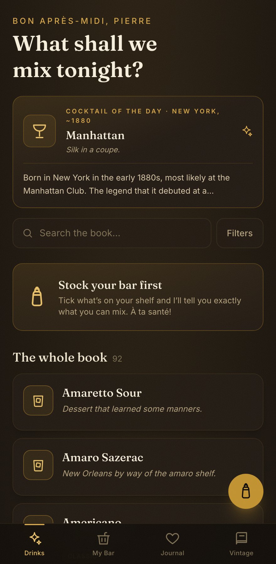
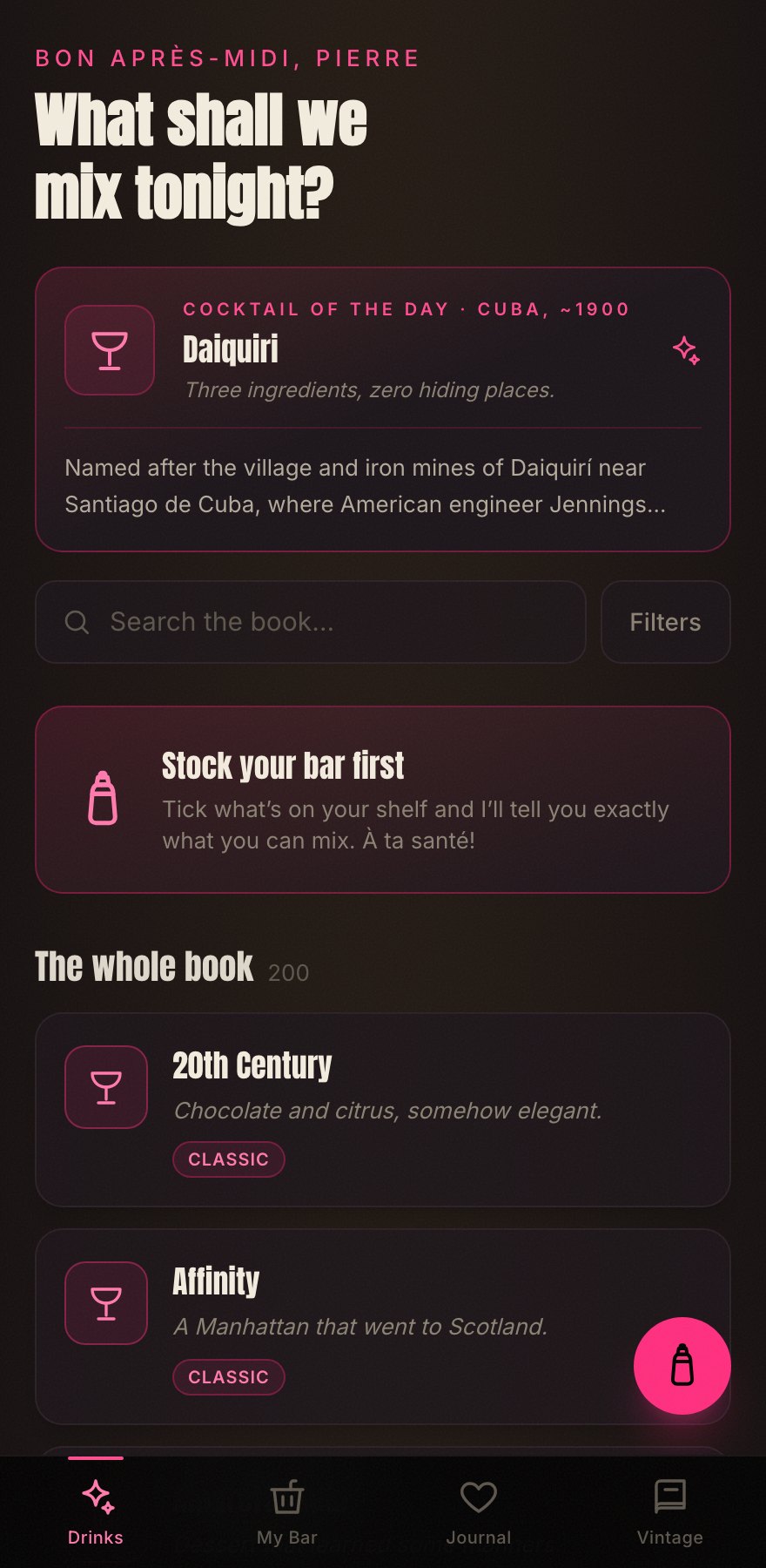
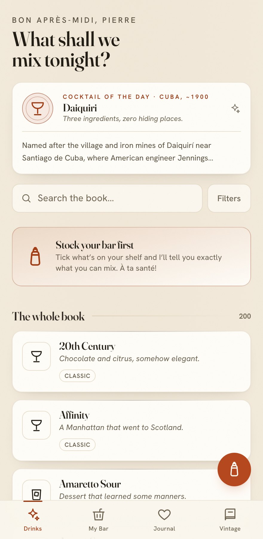
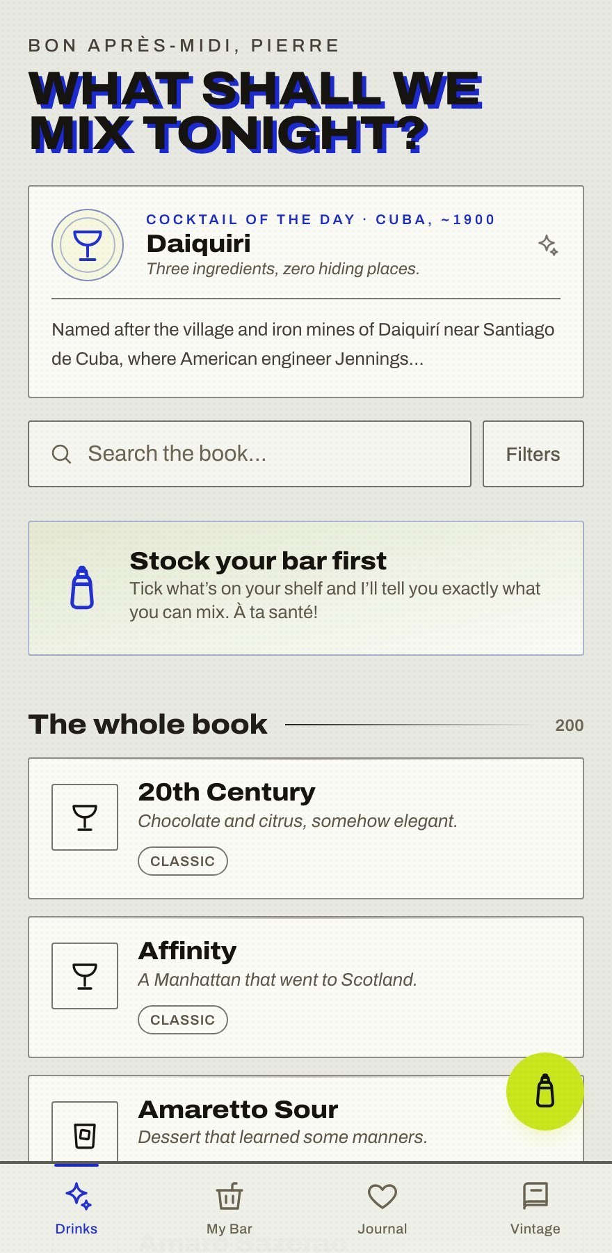
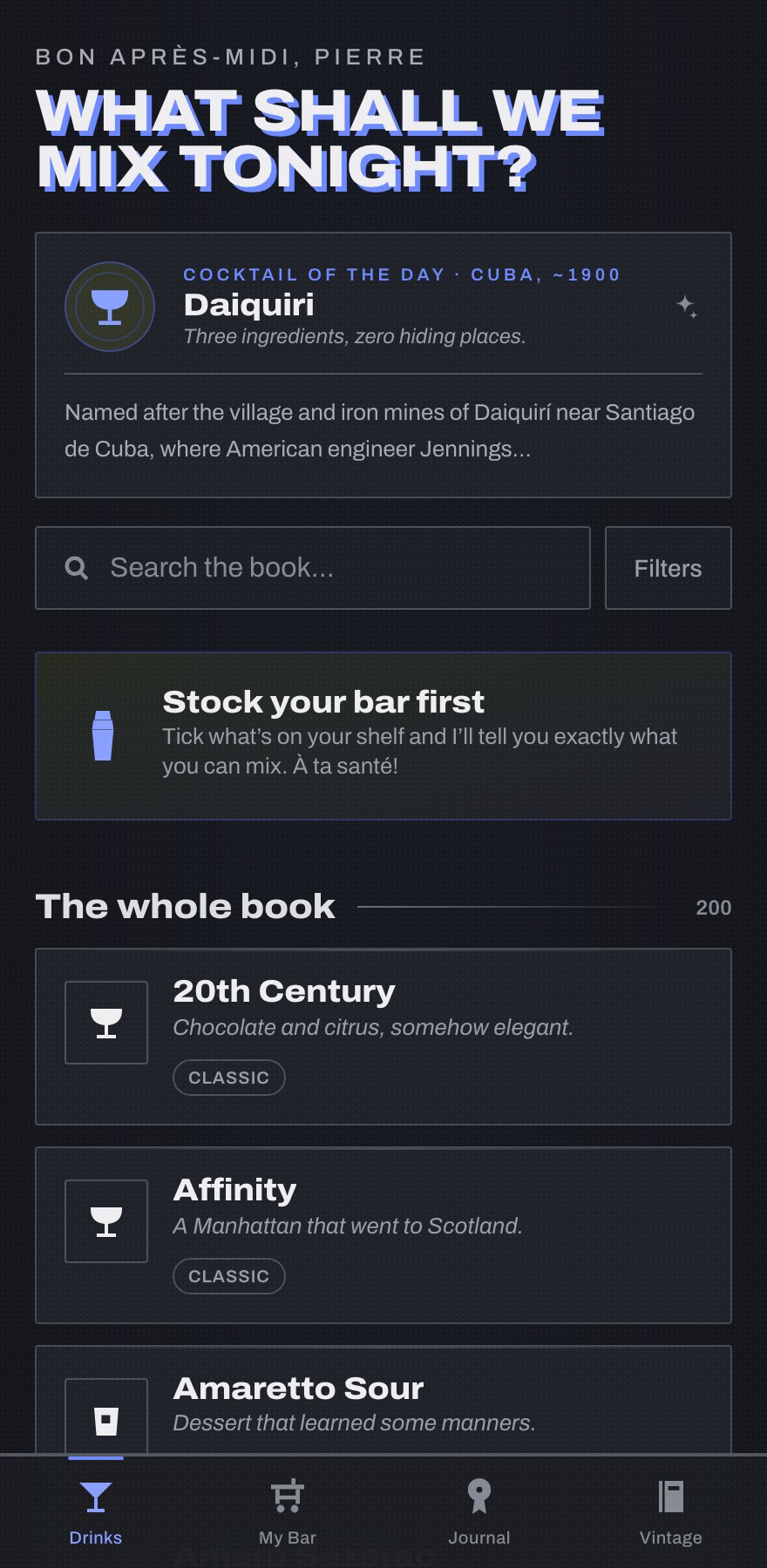
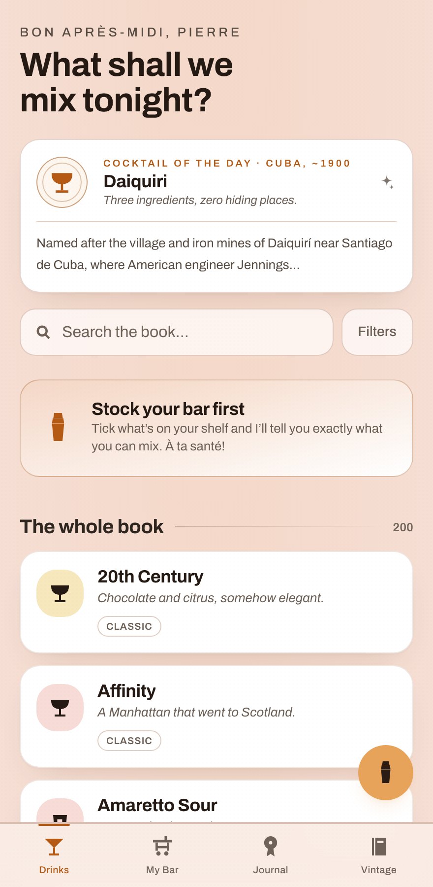
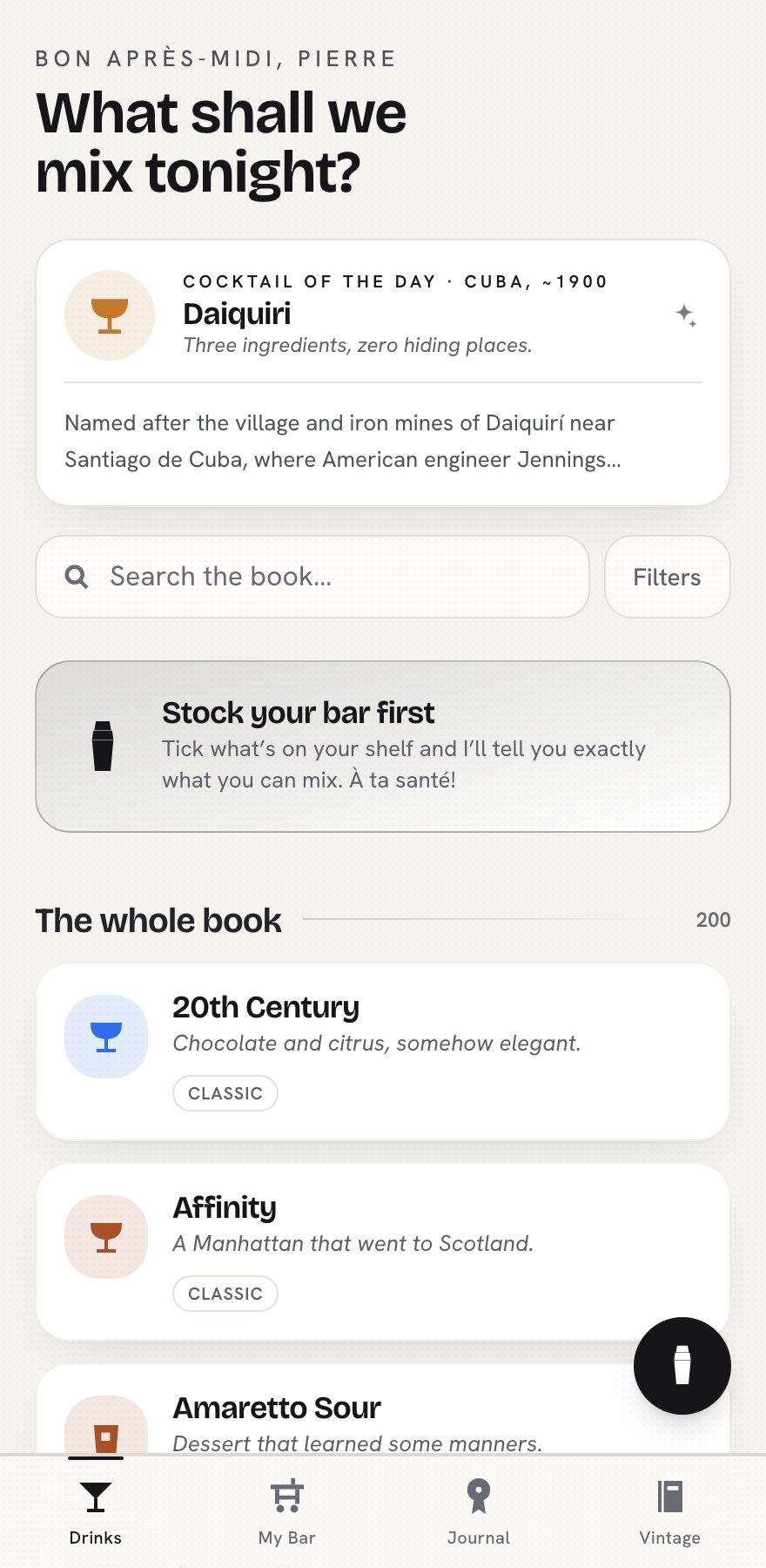
And one that got away: Vert de Nuit, a bottle-green evening skin, was never committed. It existed for an afternoon in the working tree, lost to a git checkout — the only design in this project that survives purely as memory. Which, given the thesis of this case study, feels appropriate.
What the graveyard taught me: the chrome changed seven times, but three things were present in the very first commit and never moved — the voice, the home-page bones, and the promise (tick your shelf, I’ll tell you what you can mix). The redesigns were never about what the app said. They were a search for how it should feel saying it.
How these screenshots exist at all: git worktree. Each retired skin was checked out at its commit, rebuilt, and photographed by the same headless-Chrome pipeline, same viewport, every era. Not recreations; the actual apps, rebuilt from history.
The solution: Atelier
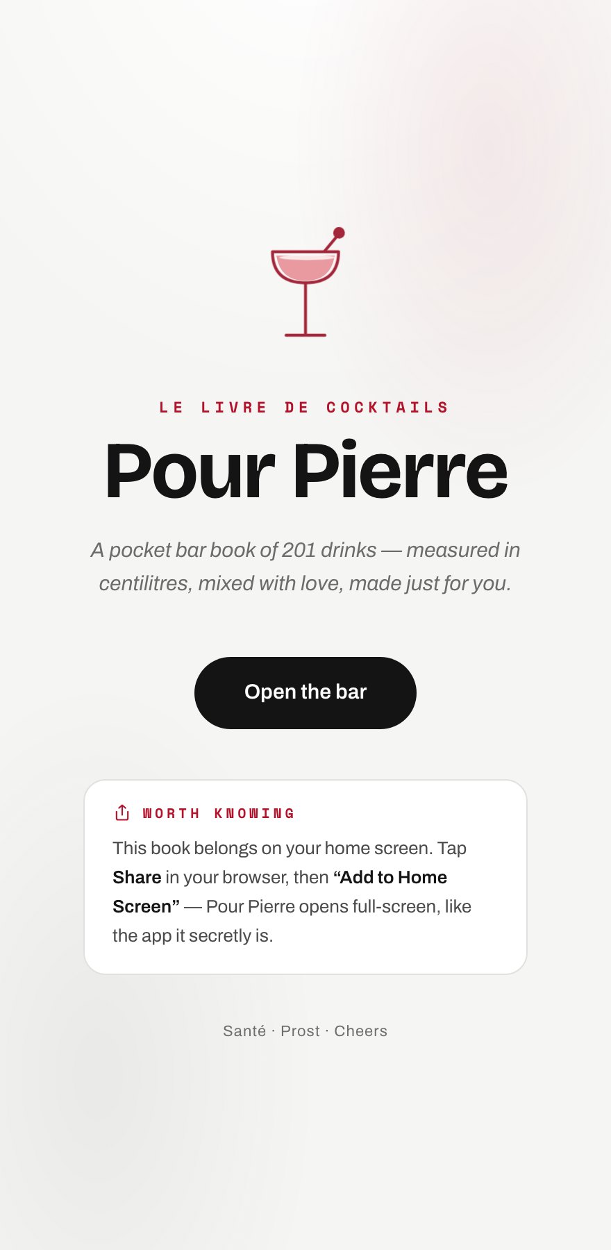
A white editorial cocktail studio that changed how the app works, not just how it looks. The home is a five-question mood quiz, not a list: swipe oui or non and the verdict suggests five drinks scored to your mood, makeable first, with honest “+1 bottle” labels. Recipes open as white editorial pages: dateline, dotted-leader ingredients in centilitres, substitution hints, a party scaler. My Bar understands brand names in three languages (Cointreau → orange liqueur, Zitrone → lemon).
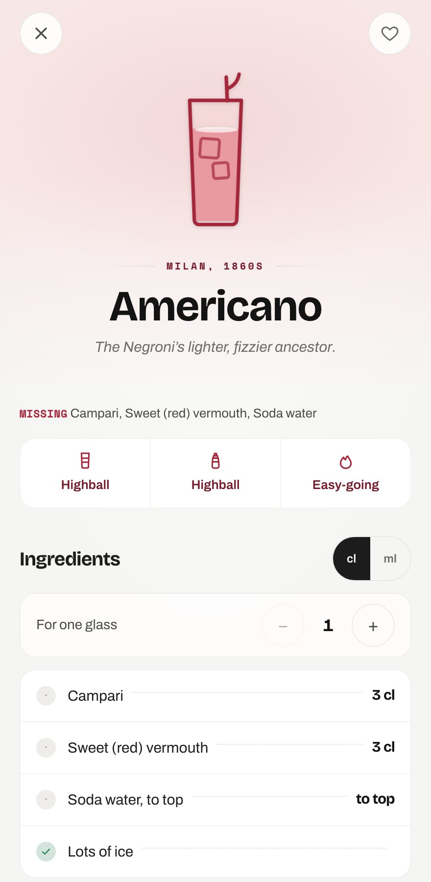
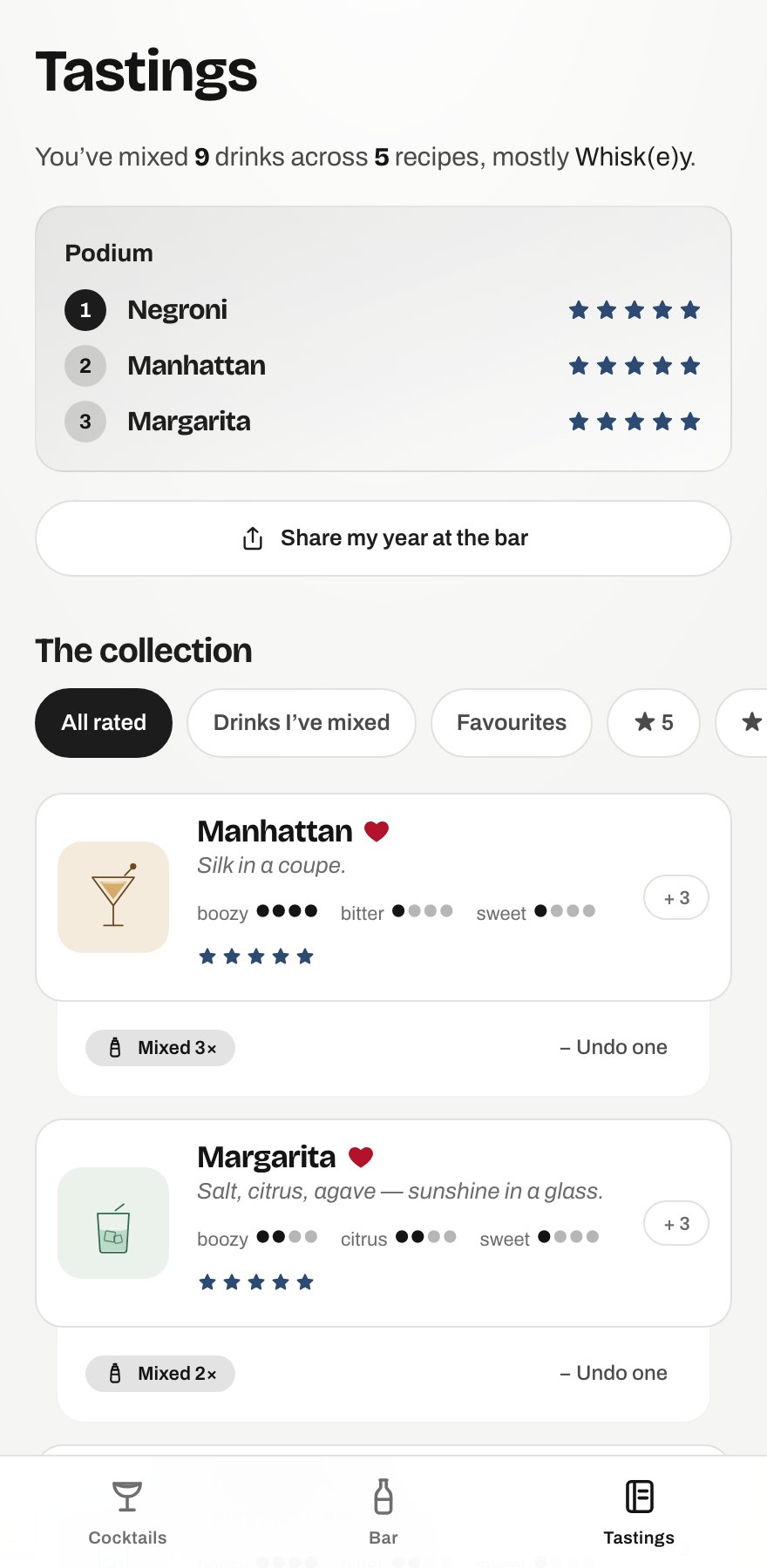
Design system: true-neutral white (deliberately not cream or parchment), a near-black ink ramp, one deep-navy accent, true red reserved for meaning. Type is Bricolage Grotesque, Archivo and Space Mono, self-hosted so everything works offline.
The image layer, alive
Every drink is a filled-glass illustration instead of photography: ink linework in the spirit's colour, a liquid fill, a garnish. On recipe heroes the liquid pours in, ice bobs, the surface ripples and the garnish sways. These are the real components, animating with the app's own keyframes; reduced motion freezes everything.
pour · 1s clip-path fill · ice bobs 3.6s/4.4s · surface ripples 4s · garnish sways 5s · ease cubic-bezier(0.16, 1, 0.3, 1), no bounce · reduced-motion freezes all
Going public
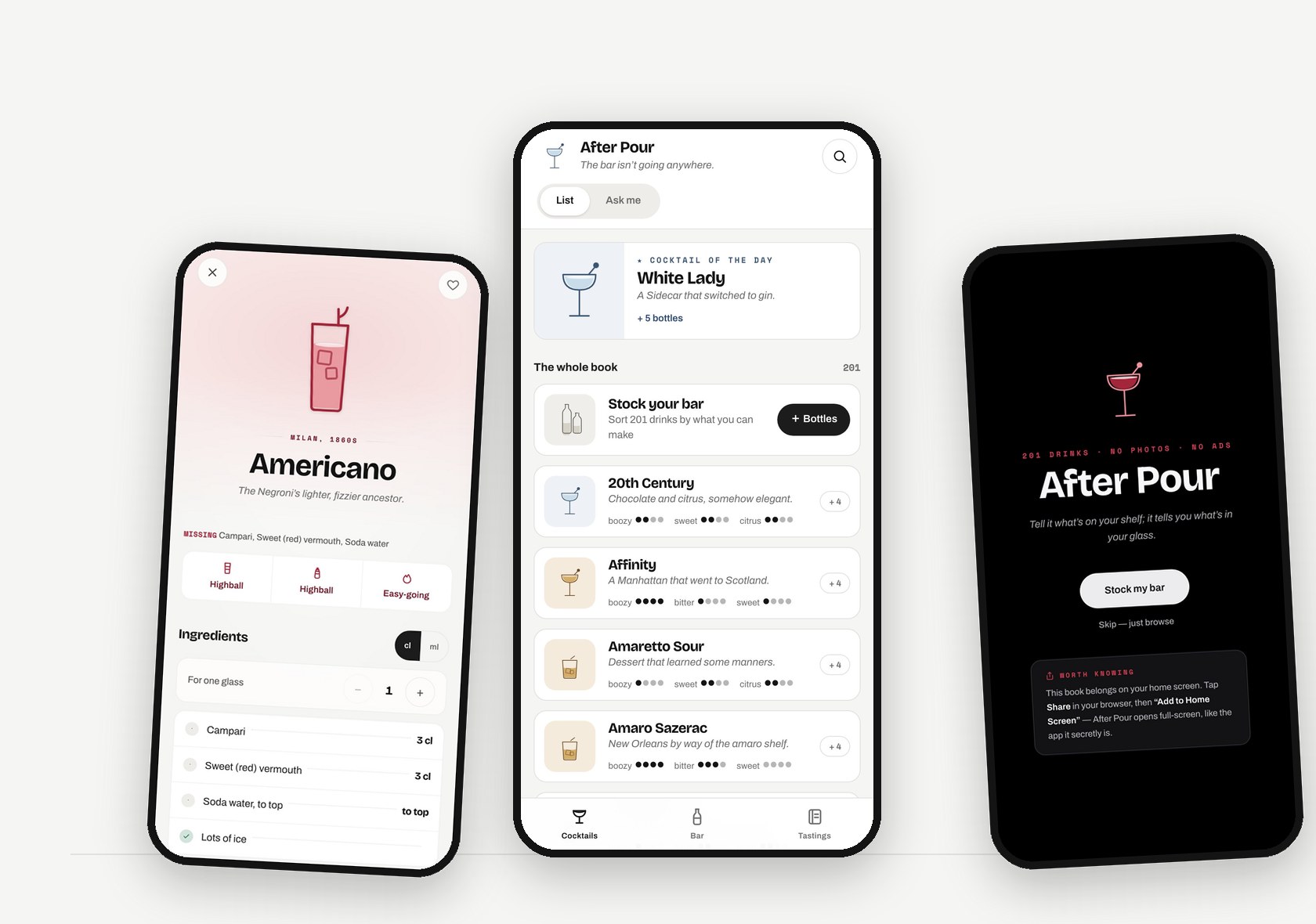
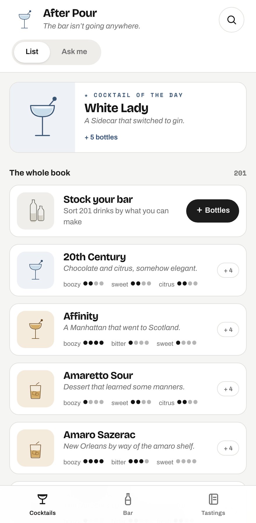
The gift landed. Then came the harder brief: Pour Pierre was built for one person, and After Pour is the version for everyone else. Turning a gift into a product turned out to be a design problem, not a find-and-replace.
What had to go: the French dedication, the birthday easter egg, the bon après-midi, Pierre masthead. The voice was recast from French bartender to deadpan connoisseur — same dry humour, no longer addressed to a specific person.
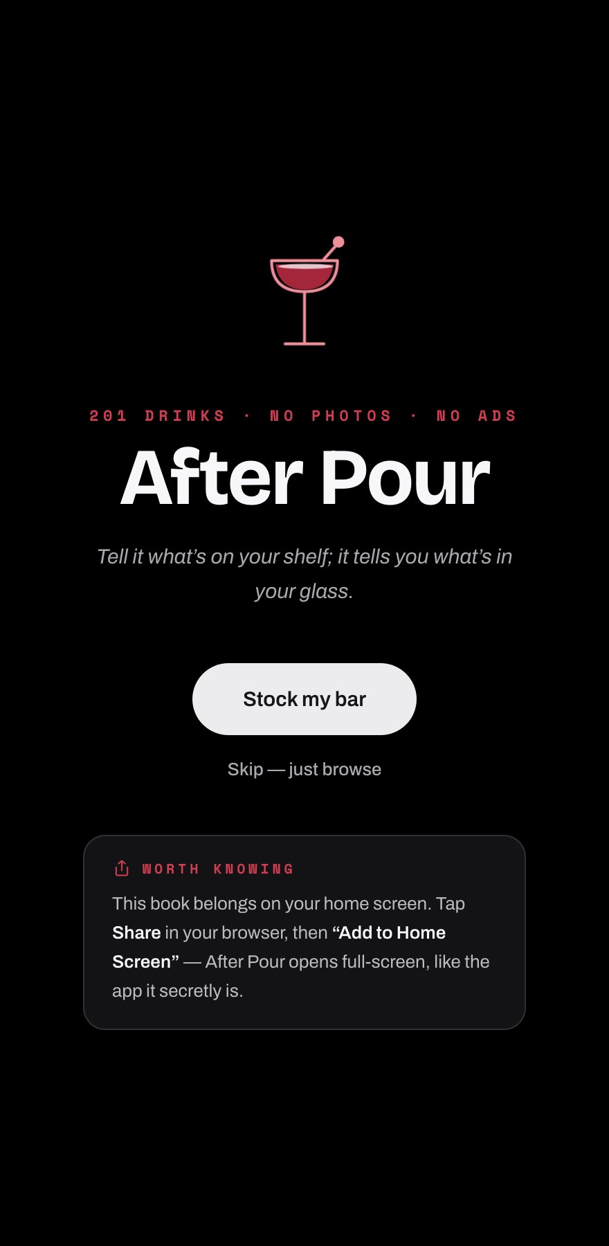
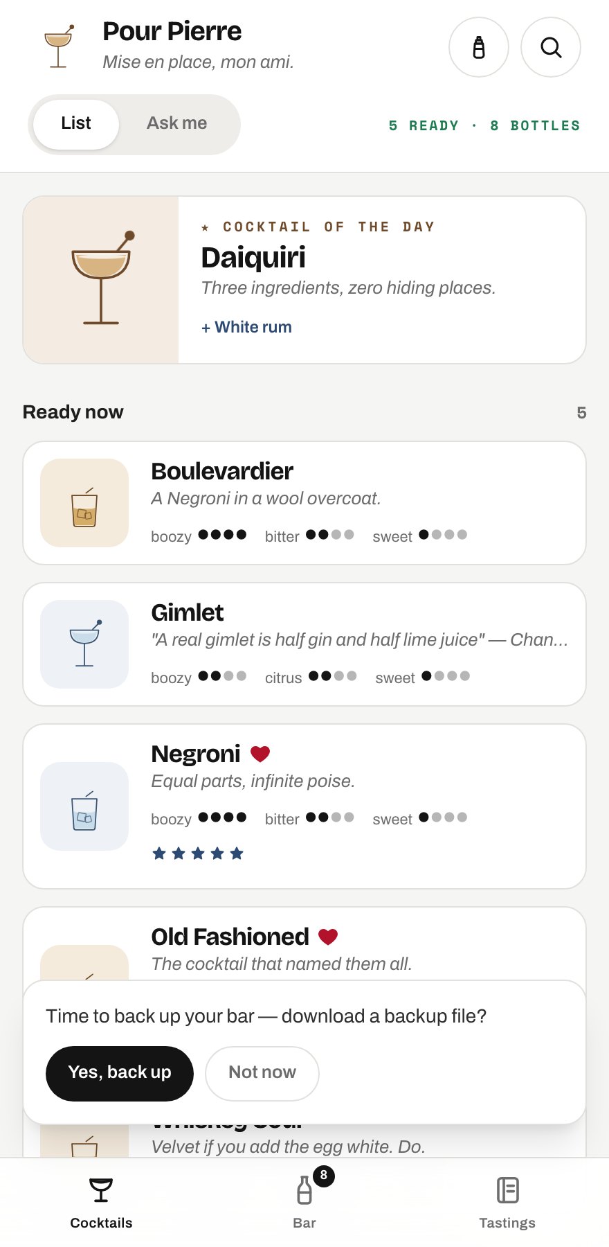
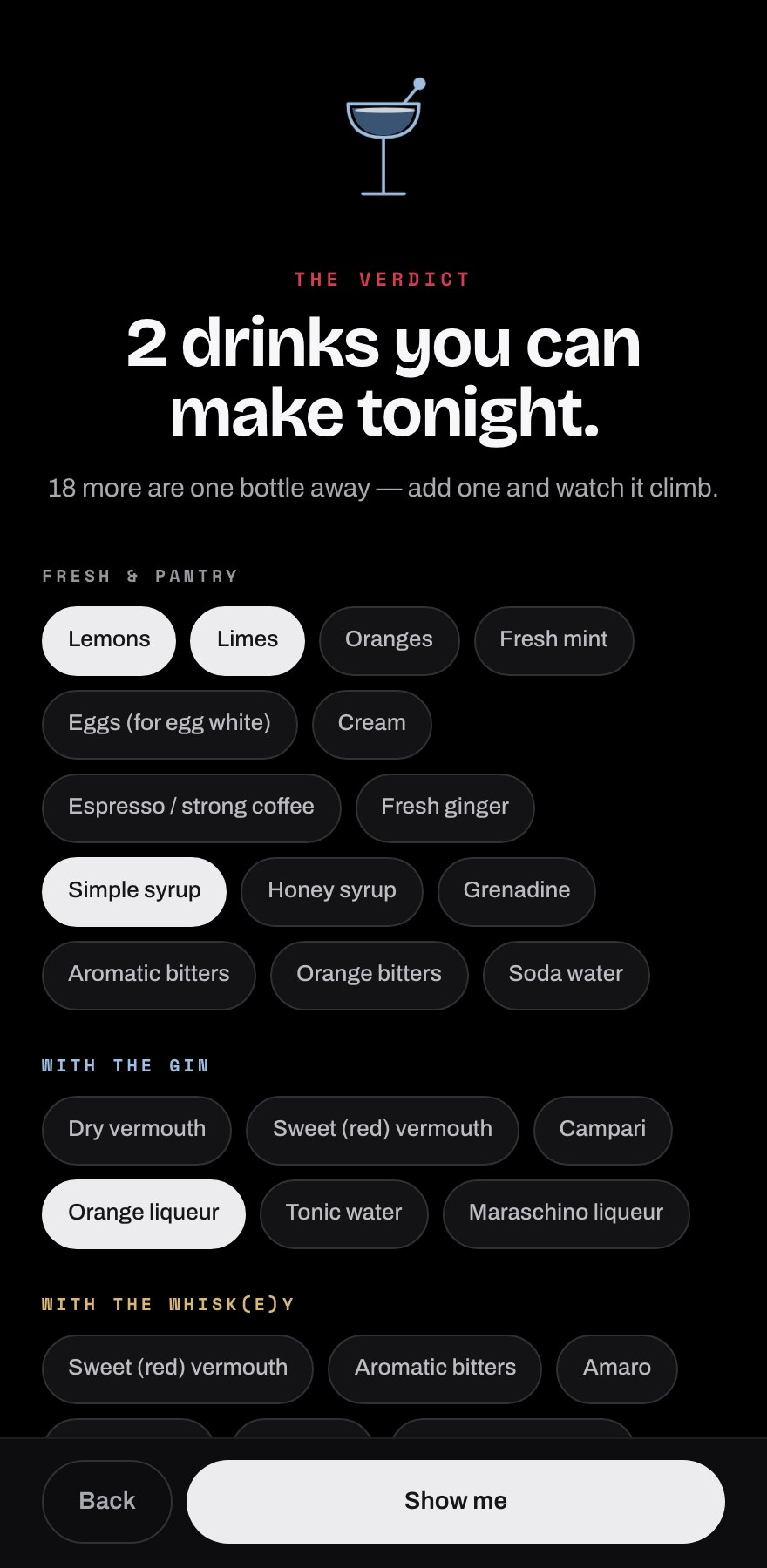
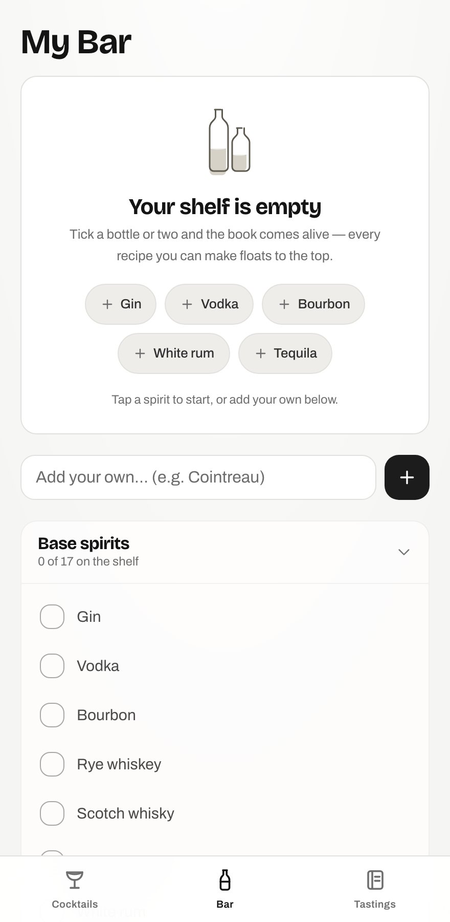
What had to be built: an onboarding that earns its keep. The first public onboarding was five screens of setup-before-value. The research says that’s exactly backwards: completion craters past 3–4 steps (Appcues’ data across ~15M flows), and NN/g’s blunt advice is to skip setup you haven’t earned. So the rework inverted it: five screens became three, and the two chore screens became the reward — companion bottles and pantry items now live on the verdict as a live loop. Tap “sweet vermouth” and watch the count climb from 6 to 9. Every tap has a visible payoff. And the flow can’t end on zero: no bottles yet reframes as “you’re one bottle from your first drink.” An empty state is a design brief, not an apology.
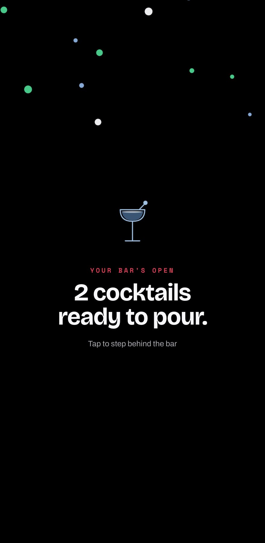
One earned celebration — a single confetti moment at completion, and never again. Confetti inflation is real and I refuse to participate.
Results & impact
From 92 recipes at the first commit to 201 shipped (one hidden), each with researched histories, across ~90 commits and seven full skins — in a PWA that makes zero external network requests and works fully offline. Deliberately boring tech: React, Vite, Tailwind, Netlify. No backend, no accounts, no tracking. And the real result, twice over: Pierre uses it, and the public edition is bound for the App Store. The gift landed, then grew up.
Next steps
The book keeps growing as the bar does: more prep-kitchen recipes, richer tasting stats, and the guardrail documents keep evolving as my own taste sharpens. Next time I disagree with what the AI produces, that disagreement becomes a new rule in the repo, not a one-off correction.